|
|
Chinese Calligraphy in Kai Shu (Standard Style) 楷 書
Updated: 06/24/2014
Kai
Shu (also called Zeng Shu, 真書
)
was initiated by Wang Ts-Zhong ( 王次仲
) toward the end of the Han
Dynasty according to the legend. During the Wei
and Jin Dynasties, Zhong Yao (151-230) and Wang Hsi-Chih (303-363) initiated
a new way of writing that allowed Kai Shu and Li Shu to separate and form two
systems.
It is said Kai Shu was matured by Zhong Yao ( 鍾繇 ) in the Wei Dynasty. It’s a more standardized form of writing than Hsin Shu.
Zhong Yao’s mixture of Kai Shu and Hsin Shu
Wang Hsi-Chih learned Zhong Yao’s Kai Shu from Madame Wei ( 衛夫人 ) and his uncle Wang Yi ( 王廙 ). He also obtained the original manuscripts of Zhong Yao from his uncle Wang Dao ( 王導 ). Thus, Wang Hsi-Chih was considered the lineage holder of Zhong Yao’s Hsin and Kai Styles of calligraphy. Many of Wang Hsi-Chih’s small-scale calligraphy works like Ye Yi Luan ( 樂毅論 ) and Huang Ting Jing ( 黃庭經 ) were resembling some of the characteristics of Zhong Yao's Kai Shu.
Madame Wei’s small-scale Kai Shu
There was another lineage of Kai Shu handed down by Shu Yi-Guan ( 師宜官 ), Liang Hu ( 粱鵠 ) and Han-Dan Tsuen ( 邯鄲淳 ) to the Wei family (Wei Bo-Ru 衛伯儒, Wei Guan 衛瓘 and Wei Heng 衛恆 ) and the Tsui family (Tsui Yeh, Tsui Chian, Tsui Hong, and Tsui Hou.) Some of them were teaching calligraphy in government departments and in the upper society. Many of the tablets of the Northern Dynasties unearthed recently were believed to be from this lineage, even though most of works were anonymous. However, they share some common characteristics:
Their brush strokes retained Li Shu characteristics.
There were alternative and incorrect ways of writing some characters.
Some writings were even mixed with Zuan, Li, and Kai Styles together.
Many tablets were excellent Kai Style calligraphy works.
However, most of those tablets were buried under the ground during the Sui and Tang Dynasties and were not available for study.
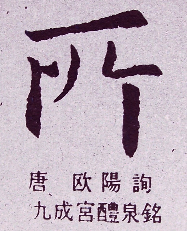
During the Tang Dynasty, there were a few prominent Kai Style calligraphers like Yu Shu-Nan ( 虞世南 ), Oh-Yang Sheun ( 歐陽詢 ), Chu Sui-Liang ( 褚遂良 ) and etc. In the middle Tang era, Yen Jen-Ching ( 顏真卿 ) changed significantly the styles of the earlier calligraphy of the Tang Dynasty. His works look solemn, dignified, and majestic. Liu Gong-Chuan ( 柳公權 ) after Yen Jen-Ching created a thinner style compared to Yen’s yet still full of energy. Yen’s calligraphy was considered sinewy and Liu’s was bony.
|
Basic Characteristics and Rules of Kai Shu |
|
|
|
|
|
|
|
|
|
|
|
|
|
If a Chinese calligrapher either in or outside China practices Chinese
calligraphy in simplified Chinese characters, s/he will be ridiculed
by other Chinese calligraphers (including those in China.)
Note:
"Chinese
calligraphy in ink and brushes" refers to the type of calligraphy art
practiced with ground ink and various types of calligraphy brushes made up with
animal hairs. There is another type of calligraphy in pen (or pencils) practiced
by the Chinese people today without using brushes and ground ink - literally we
call it "handwriting" or "hard pen calligraphy ( 硬筆書法
Today,
for the sake of convenience and avoiding grinding ink and also for personal
hobby, some people practice writing Chinese characters (not only limited to
Kaishu) with regular pens and paper instead of using the Four Treasures. This
type of calligraphy is "hard pen calligraphy ( 硬筆書法
To avoid confusions and misunderstanding, sometimes I use "Chinese calligraphy in ink and brushes" in many articles on this Website. Personally, I don't have time to practice 硬筆書法. (My father is good at 硬筆書法, but he never practices Chinese calligraphy in ink and brushes.) If you are interested, you may Google 硬筆書法.
Kai
Shu came into use by the end of the Han Dynasty. It has been used in China for
more than 2,200 years. Kai Shu is now the main Chinese writing style. The
computer fonts, newspapers, textbooks, and government documents are written
in Kai Shu today. Except for the sake of practicing Chinese calligraphy with ink
and brushes, those
medias are often not printed in Zuan, Li, Tsao, and Hsin Styles.
It's said that as early as 1928 the government of Republic of China (R.O.C.) was planning to simplify some Chinese characters. Yet the project was delayed and interrupted because of the civil wars in China at that time.
Later the Chinese Communist government in mainland China adopted a more convenient version of Simplified Chinese Characters ( 簡體字 ) while Chinese people in Taiwan, Singapore, Hong Kong, Korea, and other Asian countries and north America are still using Traditional Chinese Characters ( 繁體字 ). Both systems are Kai Shu. There are no simplified versions of Seal, Clerical, Running, and Walking Styles. The inventors of Simplified Chinese Characters borrowed some characters from the Running Style to reduce the number of strokes in many Kai Shu characters; they also coined a lot of new characters without historical and linguistic basis, thus creating confusions and misunderstanding in certain communications and severe gaps in the studies of Chinese philosophy, classics, literature, calligraphy, calligraphy inscriptions on painting, linguistics, and many other fields.
The Simplified Chinese Characters have fewer strokes suitable for casual writing in today’s business and technological environments; the Traditional Chinese Characters retain the founding principles of creating Chinese characters. Chinese calligraphy in ink and brushes can only be practiced using Traditional Chinese Characters. Students, teachers, and calligraphers on mainland China don’t practice Chinese calligraphy in ink and brushes with simplified characters. If so, the beauty and the underlying principles and theories of Chinese calligraphy will be totally twisted and destroyed.
|
Traditional
Chinese Characters refer to one of two standard sets of printed Chinese
characters. The modern shapes and structures of Traditional Chinese Characters
as used today first appeared with the emergence of the Clerical Script
(i.e., Li Shu or Clerical Style) during the Han Dynasty, and have
been
more or less stable since the 5th century during the Southern and
Northern Dynasties. The term "traditional" is used to contrast
traditional characters with another standardized set — Simplified
Chinese Characters, standardized by the government of the People's
Republic of China since the 1950s.
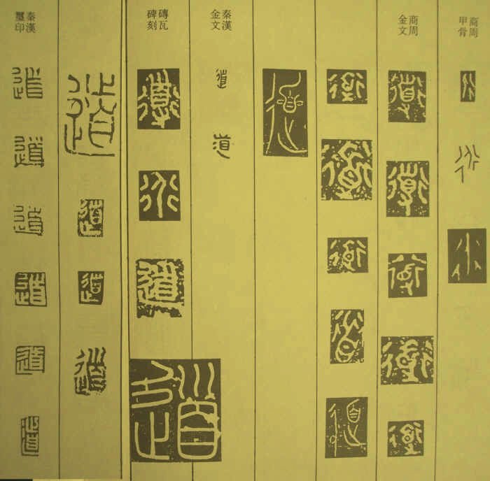
Various ways to write “Tao (the Great Way)” in Seal Styles
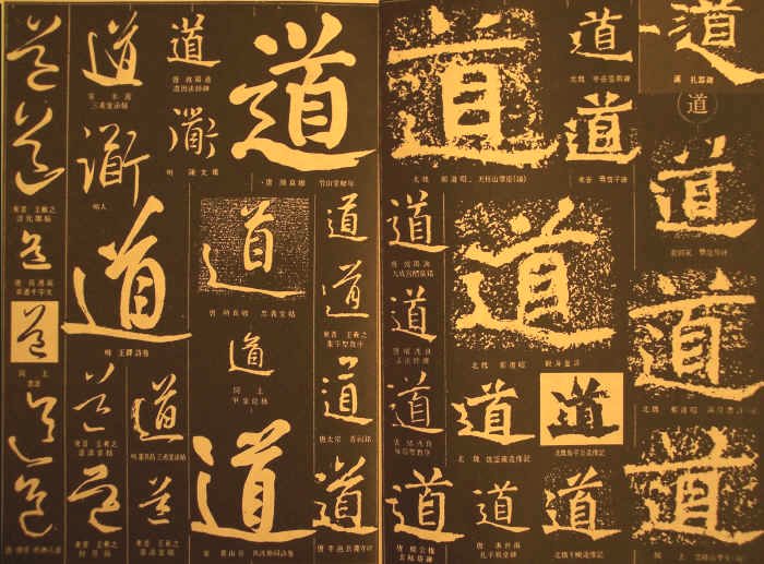
Various
ways to write “Tao (the Great Way)” in different styles
Since 1950s, the government of People's Republic of China adopted some characters with fewer strokes from some ancient writings and coined some characters with fewer strokes to replace some characters with more strokes yet already existed for thousands of years. Hence the term "Simplified Chinese Characters ( 簡體字 )" as opposed to Traditional Chinese Characters ( 繁體字 ). 繁 means "tedious" or "complex"; it does not mean "traditional." 體 means "styles" and 字 means "characters." 字 does not mean "symbols" because Chinese characters or written languages are not symbols. The purpose of adopting Simplified Chinese Characters in the PRC was meant for an easier reading (with less number of characters) and less pen-strokes in writing characters. It is the attempt of making Chinese more phonetic rather than having many words pronounced the same.
The
importance of Traditional Chinese Characters lies in the fact that each
character represents a very specific meaning or alternative meanings.
This is of extreme importance because it allows the reader to understand
a written word even without the word being in context. However,
if Traditional Chinese Characters are to be replaced totally or
partially by Simplified Chinese Characters, one would not be able to
understand immediately these texts and writings because words have lost
their meanings and they simply represent a way of pronouncing the texts.
As time progresses, this has resulted in the lost of history and culture
studies. Even in China, students of graduate schools or higher education
must learn Traditional Chinese Characters in order to study the classics
of The Book of Changes (I Jing), philosophy, calligraphy,
painting, martial arts, Chinese herbs and acupuncture, literature, and
many historical documents.
|
|
李教授鍌 一、「繁體字」與「正體字」的差異
(一)中國文字自古以來即稱為正體字,並無「繁體字」之名。 (二)「繁體字」是大陸自1956年公布「漢字簡化方案」以後,將未經簡化的漢字,統稱為「繁體字」。 (三)把所有未經簡化的正體字,統稱為「繁體字」,這是把「正體字」污名化,給人一種錯覺,認為正體字都是繁的、難寫的,簡化字才是好寫的,容易學的。 (四)1986年為便於群眾使用規範的「簡化字」而公布的「簡化字總表」,總共只有2235字,按理說,所謂「繁體字」應是指與2235個簡體字對應的正體字而言,而今卻將所有的正體字統稱為「繁體字」,這是不合理、也不合邏輯的事。其實正體字的形體本來即是如此,並無繁簡之分。 (五)為免落入陷阱,政府應該大力導正,稱為「正體字」。 二、「正體字」與「簡化字」的比較 (一)「正體字」是針對「異體字」而言,所謂「異體字」,包括古字、訛字、別字、草書、民間俗體字,以及大陸的簡化字。 (二)所有「正體字」,其字構大都符合六書造字的原理,是中華民族文化遺產之一。 (三)「正體字」具備有中國文字形、音、義三者俱備的特色。 (四)學習「正體字」,可以自由閱讀古籍,不與歷史文化脫節。 (五)大陸簡化字2235字中,有1753字是偏旁簡化而衍生,另有14個簡化偏旁用字,真正獨立的簡化字不過482字,其中有四分之三是採自民國24年教育部所公布的「簡體字」324字,大體是古字、草書,以及宋元以來的俗體字,現在臺灣民間有些還在使用中。 (六)簡化字最大的問題,在於自創新字,「一對多」的同音兼代,或撮取部分部件,或以起首部件,或簡省部分部件,凡此皆不合六書造字原理,紊亂漢字系統。 (七)學習「簡化字」,是剝奪學習者自由閱讀古籍的權益,而與歷史文化脫節。 (八)學習「正體字」可輕易閱讀簡化字書籍;學習「簡化字」則必須再學習一套正體字方可閱讀,此違反學習的經濟法則。 三、「俗體字」與「標準字」的差異 (一)「俗體字」是民間各行業自創的文字,但求書寫方便,不管其字構是否合乎六書造字原則,與典籍上的「正體字」有別。包括前面所說的,有古字、別字、訛字、草書轉化字、簡體字等。 (二)「標準字」是指教育部於民國71年所公布的「常用國字標準字體表」以及後來繼續完成可供印刷用的「楷書標準字體母稿」、「宋體標準字體母稿」等。 (三)「標準字體」的研訂,有一定的原則: 1.字形有數體而音義無別的,取一字為正體之標準,其他為異體。其選取原則: (1)取最通用的。 (2)取最合於初形本義的。 (3)數體皆合初形本義的: j取筆畫最簡單的。 k取使用最廣的。 2.字有多體,其義古通今異的,並收。如:「間」與「閒」,古別今同的,亦予並收,如:「証」與「證」。 3.字的寫法,無關筆畫繁簡的,力求合於造字原理。如:「吞」不作「呑」,「闊」不作「濶」。 4.凡字的偏旁古今混的,予以區別,如「月」與「
」(肉)。 5.凡字偏旁筆畫近似而易混的,亦予以區別,如:「
」(甜、舔),「舌」(話、括);「壬」(任、妊),「
」(廷、呈)。 (四)「標準字」是書刊用字、教學用字、資訊用字,使文字能標準化、統一化,要求嚴格。 (五)「俗體字」是用於書寫,無嚴格規範,教學時不宜使用。 (六)教學時一定要求標準化,一般書寫無需多作要求。 四、適合現階段推行正體字之工作項目 (一)堅定推行正體字政策,不必隨大陸簡化字起舞。 (二)「識正寫簡」可以並行不背。 (三)多作宣揚,導正社會之觀念。 (四)對外漢語教學,可參酌情形,在教導正體字時,不妨順便認識「簡化字」,最好能加以批判。 (五)加強對外漢語教學之師資培訓,使確切認識正簡之優劣。 (六)規範電子媒體字幕應使用標準正體字。 (七)應建請教育部定期檢討「國字常用字表」,調整常用字,使配合時代脈動。
|
Recent
rumors say that the Education Ministries of Korea, Hong Kong, Taiwan, and
other Asian countries are setting up conferences with China to eventually
restore to the Traditional Chinese Characters and phase out the Simplified
Chinese Characters. There have been innumerous miscommunications,
misunderstandings, and errors in business and cultural studies in the past few
decades since the simplified version was introduced and adopted.
Many calligraphy teachers agree that students may learn Chinese calligraphy from either Kai Shu, Li Shu or Zuan Shu. Most students start from Kai Shu, or to be more precise, the Kai Shu in the Tang Dynasty, Tang Kai ( 唐楷 ). (See also: www.art-virtue.com/tutorial/index.htm#4)
|
1.
點
2.橫
3.豎
4.鉤
5.提
6.撇
7.短撇
8.捺
|
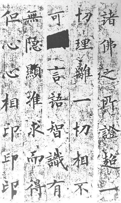
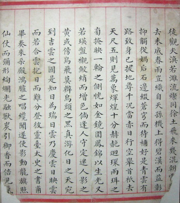
The tablets, monuments on cliffs, images on tablets, epitaphs, and rolls of scriptures during the Northern Dynasties ( 北朝 ) added richness to the legacy of Chinese calligraphy. Except for scriptures, the writings were preserved on stones. When calligraphy on paper was transferred onto stones, the level of the art had already gone down to a certain degree. The calligraphy works of the Southern Dynasties were constantly transferred from stone to stone. The more times a calligraphy work was transferred onto stones, its artistic level and nuances went down even more. Thus, compared to the work of the Southern Dynasties, Chinese calligraphy work of the Northern Dynasties gives a more original and unmodified look. This is why the Ching Dynasty calligraphers during 1800s were focusing on tablets of the Northern Dynasties.
|
Historical
Background During the Southern & Northern Dynasties After the royal family of the Jin Dynasty immigrated to south of the Long River, China became two independent countries, south and north. Both the south and the north countries were divided into several dynasties. This was the longest time of split and chaos in Chinese history from 420 to 589 AD. Calligraphy achieved a high level despite of the political unrest. Two calligraphy schools were formed during this time: the Te School ( 帖學 ) and the Bei School ( 碑學 ). 帖 usually means writings or works on paper; 碑 means works engraved on monuments or tablets. The Bei School was generally considered as styles with more strength and energy. The Southern Dynasties inherited the tradition of the Jin Dynasty. Tablets and monuments were forbidden since the Jin Dynasty and so there were more new styles of calligraphy. In contrast, the Northern Dynasties did not forbid the erections of tablets.
|
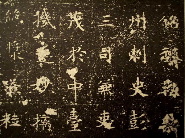
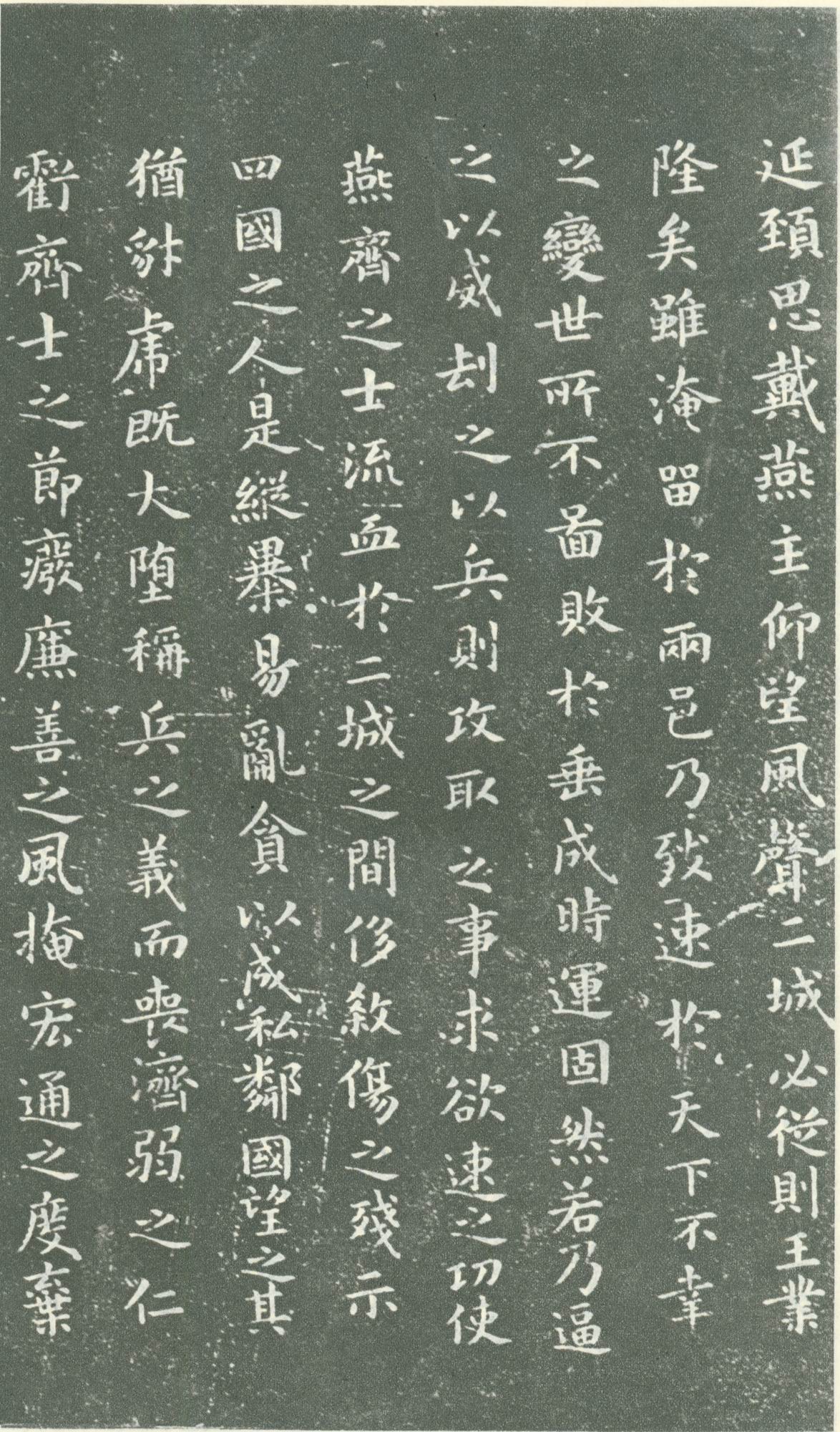
Northern Tablets ( 北碑 ) comprehensively refer to calligraphy written on tablets, monuments on cliffs, images on tablets, and epitaphs. Most of the famous tablets were erected during the Wei Dynasty and were referred as Wei Bei ( 魏碑 ) or Tablets of Wei Dynasty.
According
to Kang You-Wei ( 康有為
) and Yang So-Jing
(
楊守敬
) in the Ching Dynasty, the calligraphy work of Wei Bei inherited
the spirits and tradition of the Han and Wei Dynasties better than the Te
School, the calligraphy preserved on paper.
Since the Tang Dynasty, some calligraphers began to write each character squarely and neatly in grids. This was very opposite to the calligraphers in the previous dynasties who wrote freely without confinement. Thus Tang Kai ( 唐楷 ) looked neat and aligned. But they were not any more “natural” – they were more man-made and less inspired from Nature and the artists' mind. Thus the spiritual beauty and simplicity of human nature were confined in man-made rules and grids. Tang Kai did reach a very high level and look very beautiful and elegant; but only few calligraphers in the early Tang Dynasty had inherited the spiritual beauty and strength of the previous Northern and Southern Dynasties. Calligraphers like Oh-Yang Sheun, Chu Sui-Liang, and Yu Shu-Nan were born before the Tang Dynasty was established. They were born in previous dynasties and had learned calligraphy as it was then. At least they inherited or instilled the legacy in creating their personal styles. But what happened to most calligraphers after them who were born in the Tang Dynasty and had never learned the calligraphy of the previous dynasties? And what happened to those students who only stick to Tang Kai in their lifetime and never explore the intrinsic beauty in previous dynasties? Inevitable deterioration! (according to the proponents of the Bei School) Generally speaking, the calligraphy before the Tang Dynasty look more organic and natural while most calligraphy after the Tang Dynasty look more geometric, mechanical, and confined.
Later,
it was until Zhang Shui, Yen Jen-Ching, Huai Su, and some other calligraphers
who inherited the legacy from previous calligraphers and had their own unique
achievement. Most of the other calligraphers were just following the inevitable
path of being confined, as opposed to the natural beauty embodied in the Bei
School or Wei Bei.
During the Ching Dynasty, the study and practice of Chinese calligraphy were divided into the Te School and the Bei School. Generally speaking, before 1820 it was the Te School era and after 1820 it became the Bei School era. Since the Sung and Yuan Dynasties, the Te School that focused on the calligraphy of the Two Wangs (Wang Hsi-Chih and his son Wang Hsian-Chih) was declining and the Bei School that studied Zuan and Li Styles before the Han and Wei Dynasties was growing. This was an undeniable fact.
|
In
the early Ching Dynasty, Emperor Kun Shi ( 康熙
) favored Dong Chi-Tsun's
(
董其昌
) calligraphy and
many people studied Dong's work. At the same time, there
were people against Dong’s style because of his lack of masculine
strength. Soon more people
realized that Dong's
calligraphy was not in the top level and deep in spirits. They could
never become great calligraphers even if they achieved the same level as
Dong
did. Later, they switched to Zhao Meng-Fu ( 趙孟頫 ) who was renowned in the Yuan Dynasty but was disliked by
some serious calligraphers. However, the early Ching Dynasty’s
calligraphy environment was deeply influenced by Zhao Meng-Fu, Dong
Chi-Tsun, Su Shu, and Huang Ting-Jian.
|
As
the popularity of seal carving grew in the Ching Dynasty, Zuan Shu, Li Shu, and
the study of ancient characters
were gaining importance. Chinese calligraphy revitalized and people began to search for higher
levels of beauty from the earlier calligraphy of the Han, Wei, and Jin Dynasties.
Ruen
Yen ( 阮元 ), Bao Shu-Cheng ( 包世臣
), and Kang You-Wei (
康有為
) even published theories and
books to demean the Te School and to promote the Bei School. Many Zuan Shu and Li
Shu specialists as well as linguists were focusing on tablets from the Chin and Han
Dynasties to the Northern and Southern Dynasties.
Wei Bei is the summation of all calligraphy on tablets of the North Wei Dynasty (386-534). As the famous calligraphy theorist in the Ching Dynasty, Kang You-Wei ( 康有為 ) summarized, there are ten beauties and thirteen schools of Wei Bei.
|
The Ten Beauties of Wei Bei “魏碑十美” |
|
1.
Bold, resolute, and majestic 2.
Solemn and respectful in atmosphere 3.
Jumping and springing brush motion 4.
Strokes were precipitous and thick 5.
Consciousness and posture were surprising and graceful 6.
Spirit was flying 7.
Interest and mood were merry, lively, solid and sound 8.
Rules of bones were understood thoroughly 9.
Structures were natural 10.
Blood and muscles were lush
|
|
Selected
Masterpieces
of Wei Bei |
|||
|
|
|
|
|
|
|
|
|
|
|
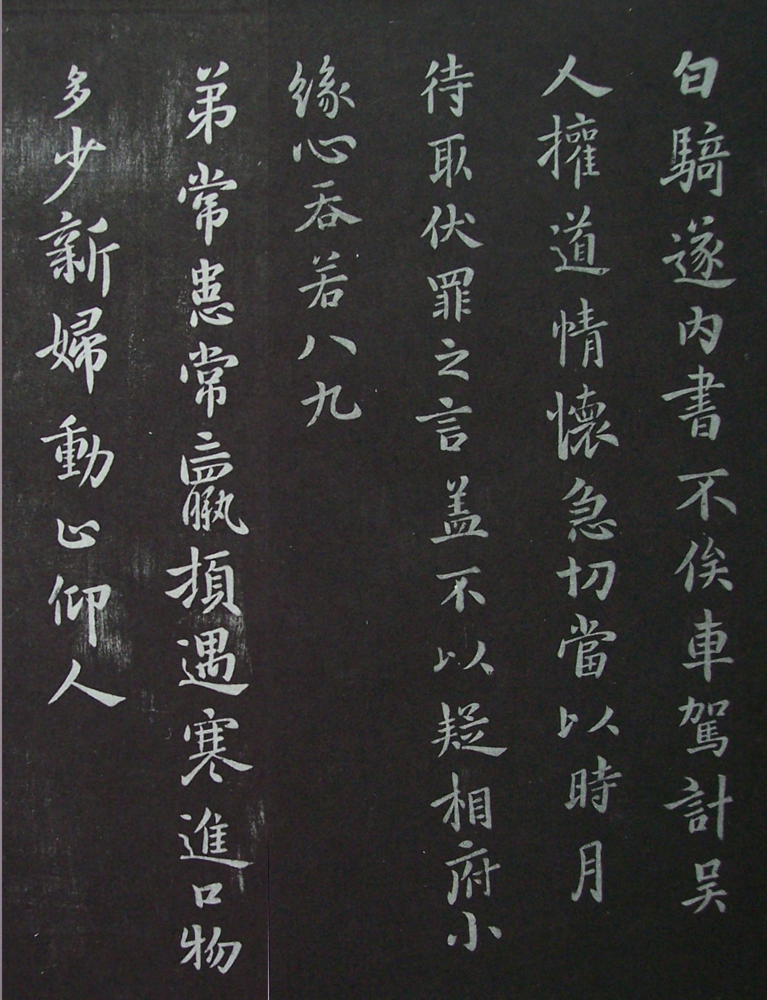
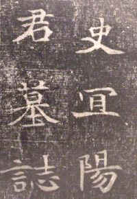
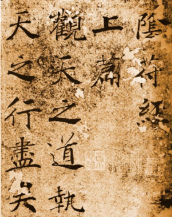
The
Zhong Yao (151-230) 鍾繇 |
|
|
|
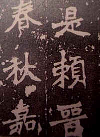
Madame Wei (272-349) 衛夫人 |
|
|
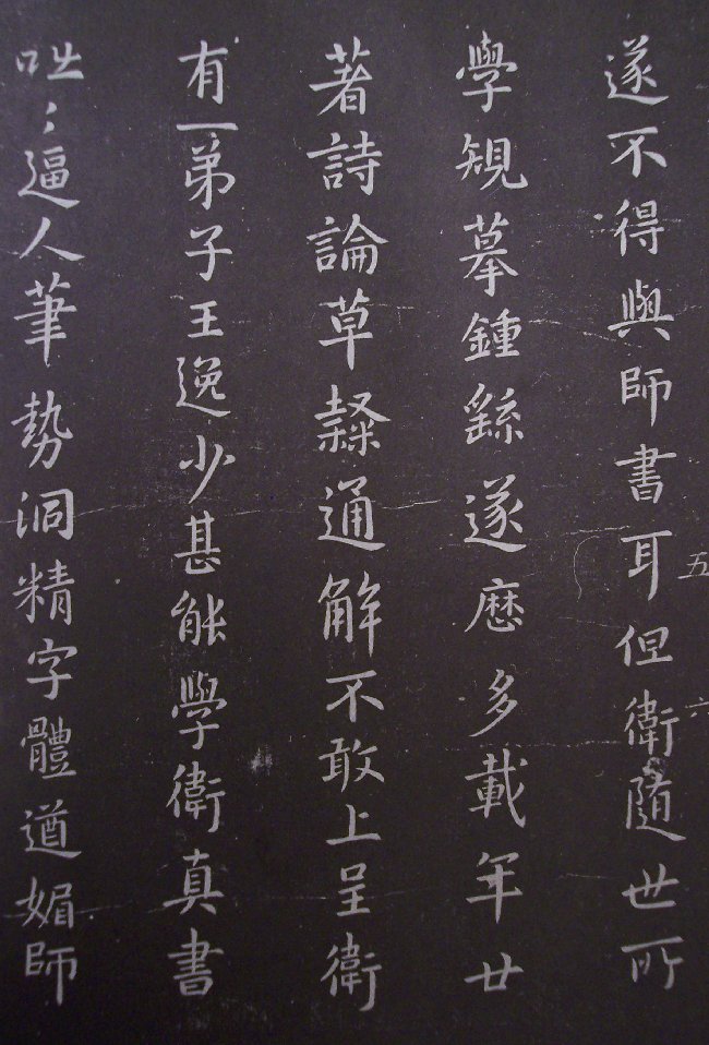
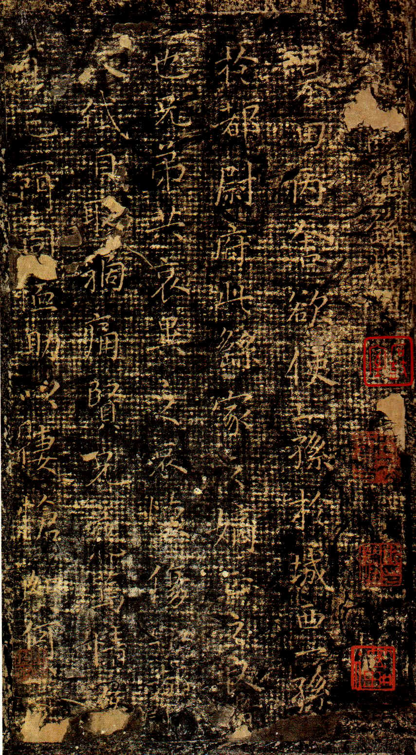
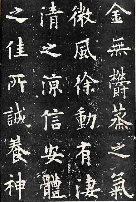
Wang
Hsi-Chih (303-361) 王羲之 |
Wang Hsi-Chih's small scale Kai Shu Ye Yi Luan ( 樂毅論 )
|
|
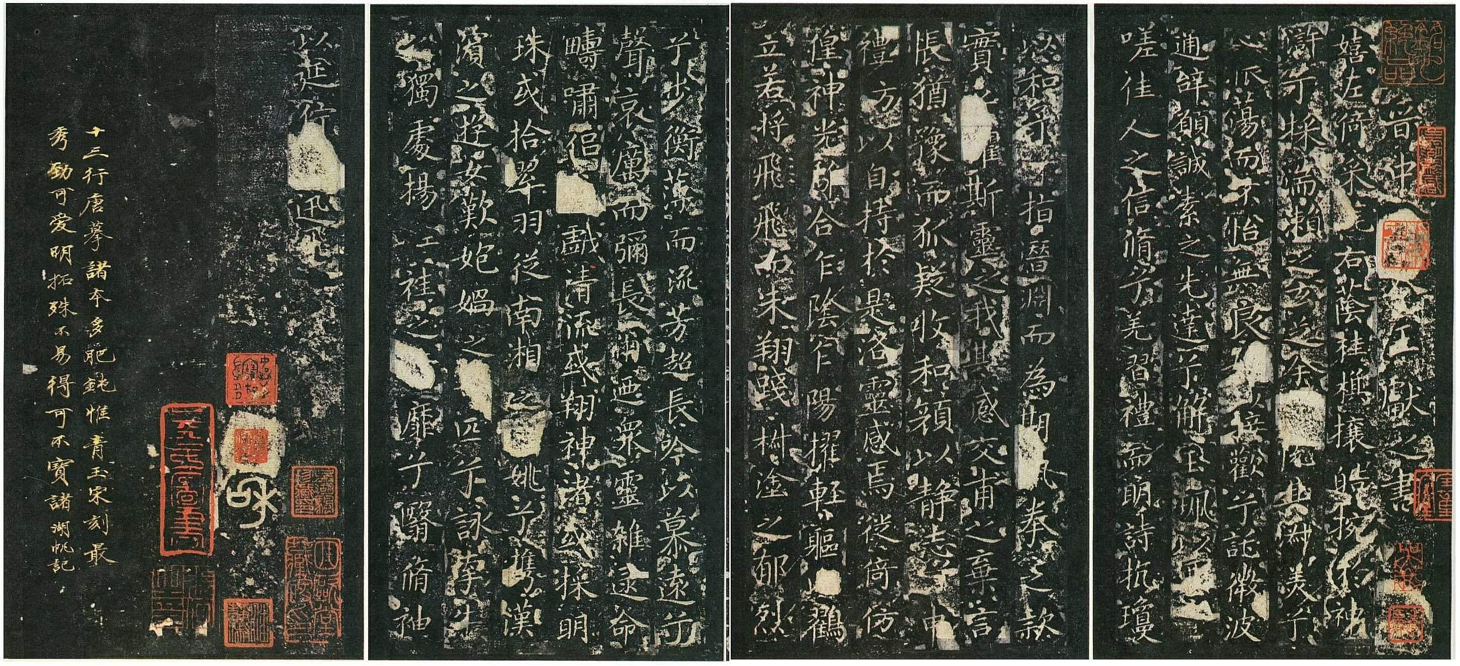
Wang
Hsian-Chih (344-386)
王獻之 |
Wang Hsian-Chih's small scale Kai Shu 玉版十三行
|
|
|
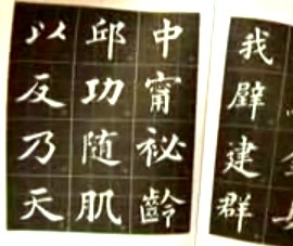
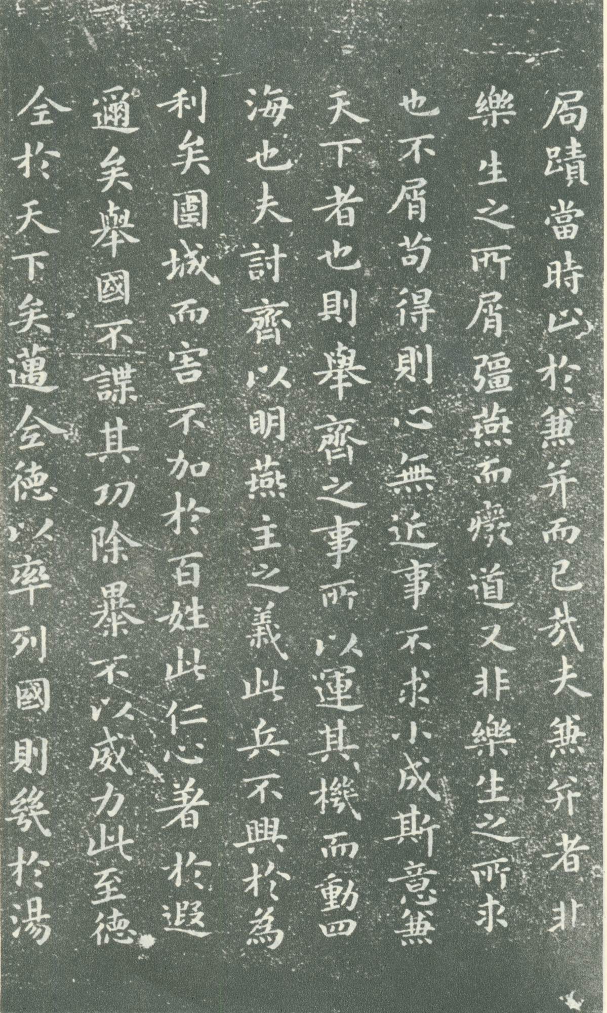
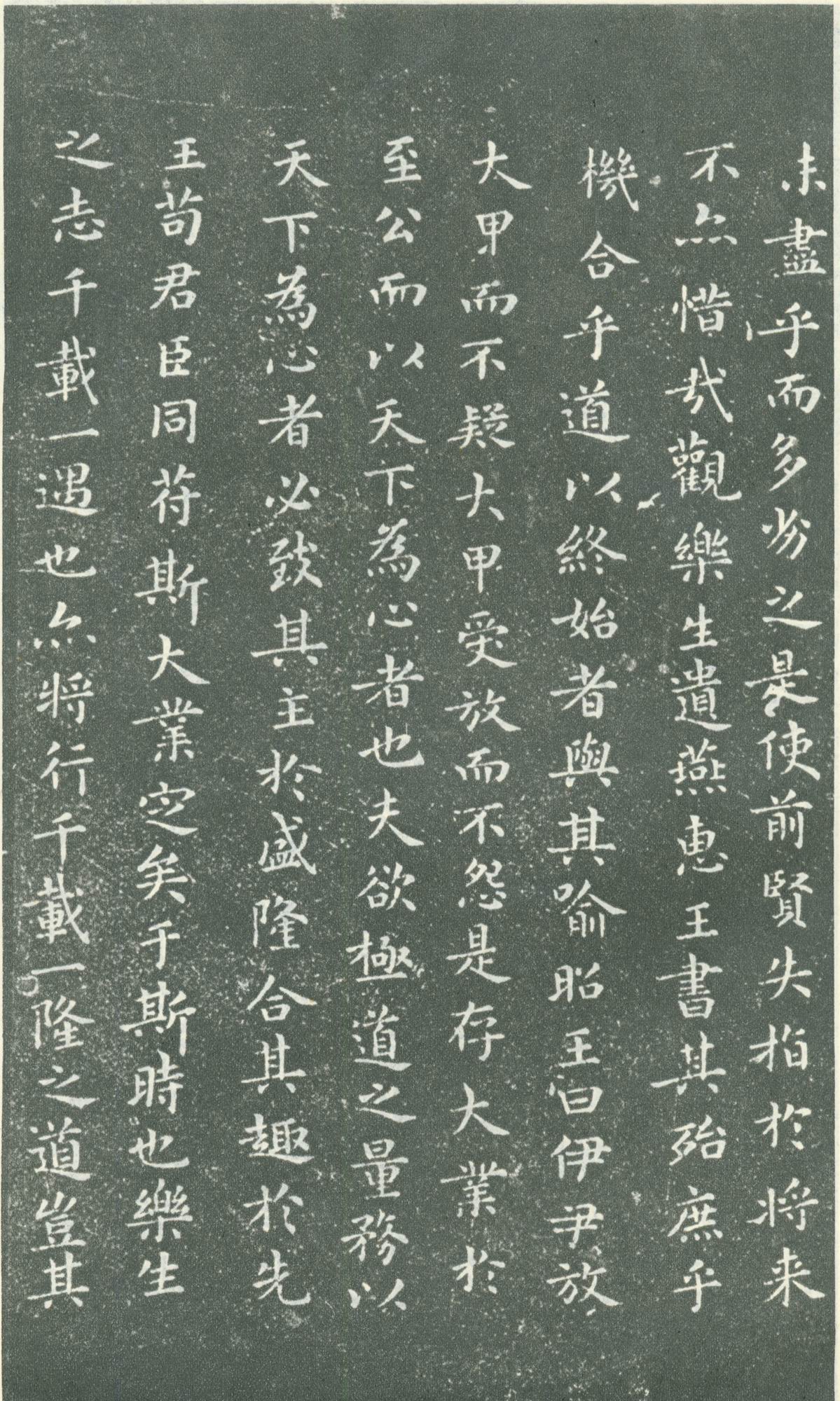
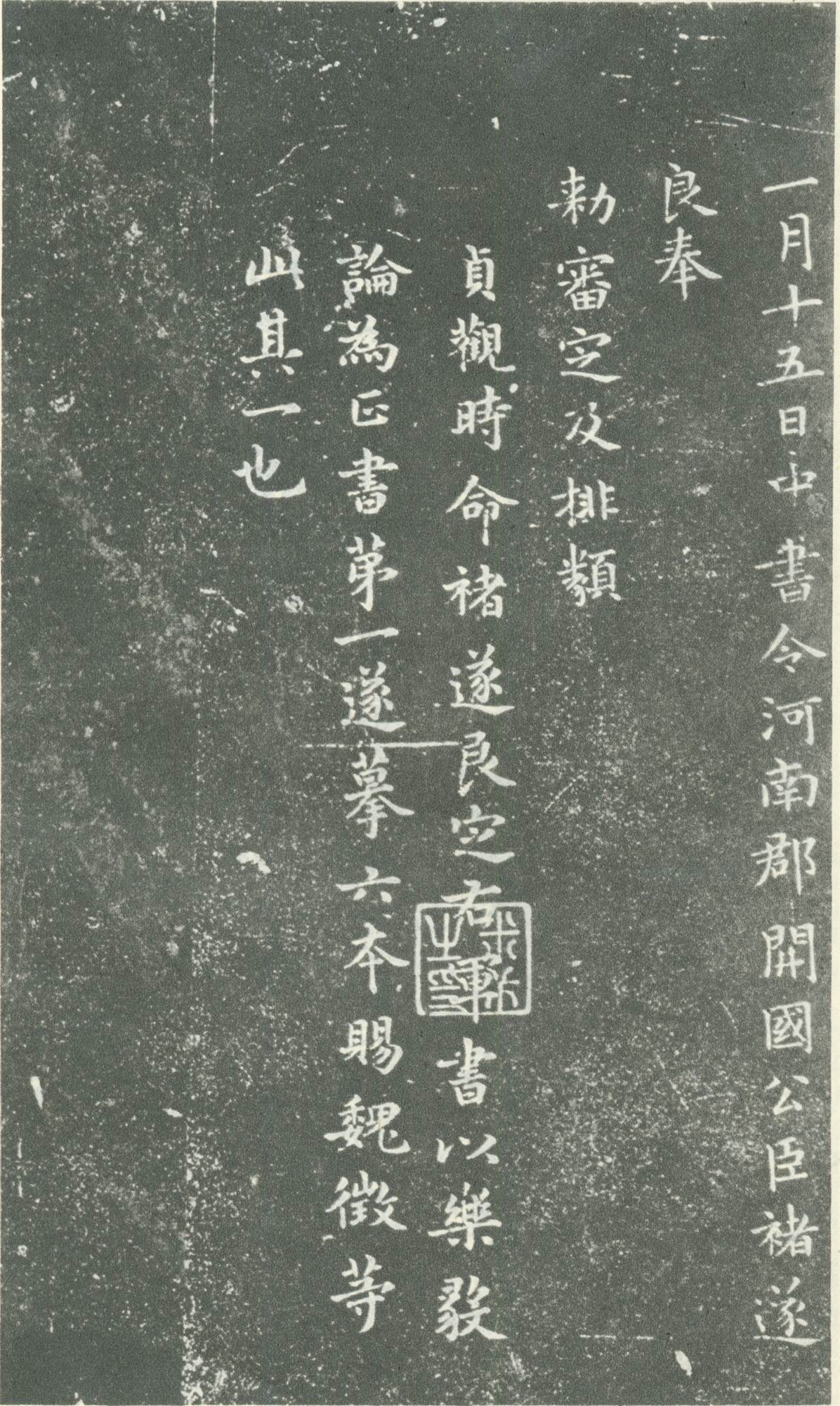
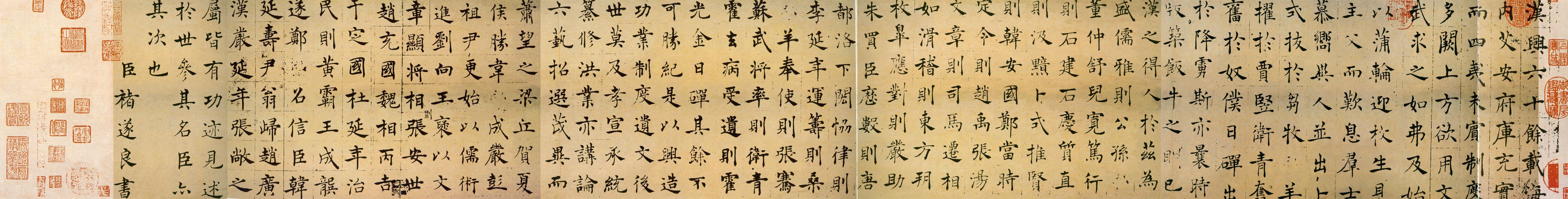
(A work attributed to Chu Sui-Liang)
|
|
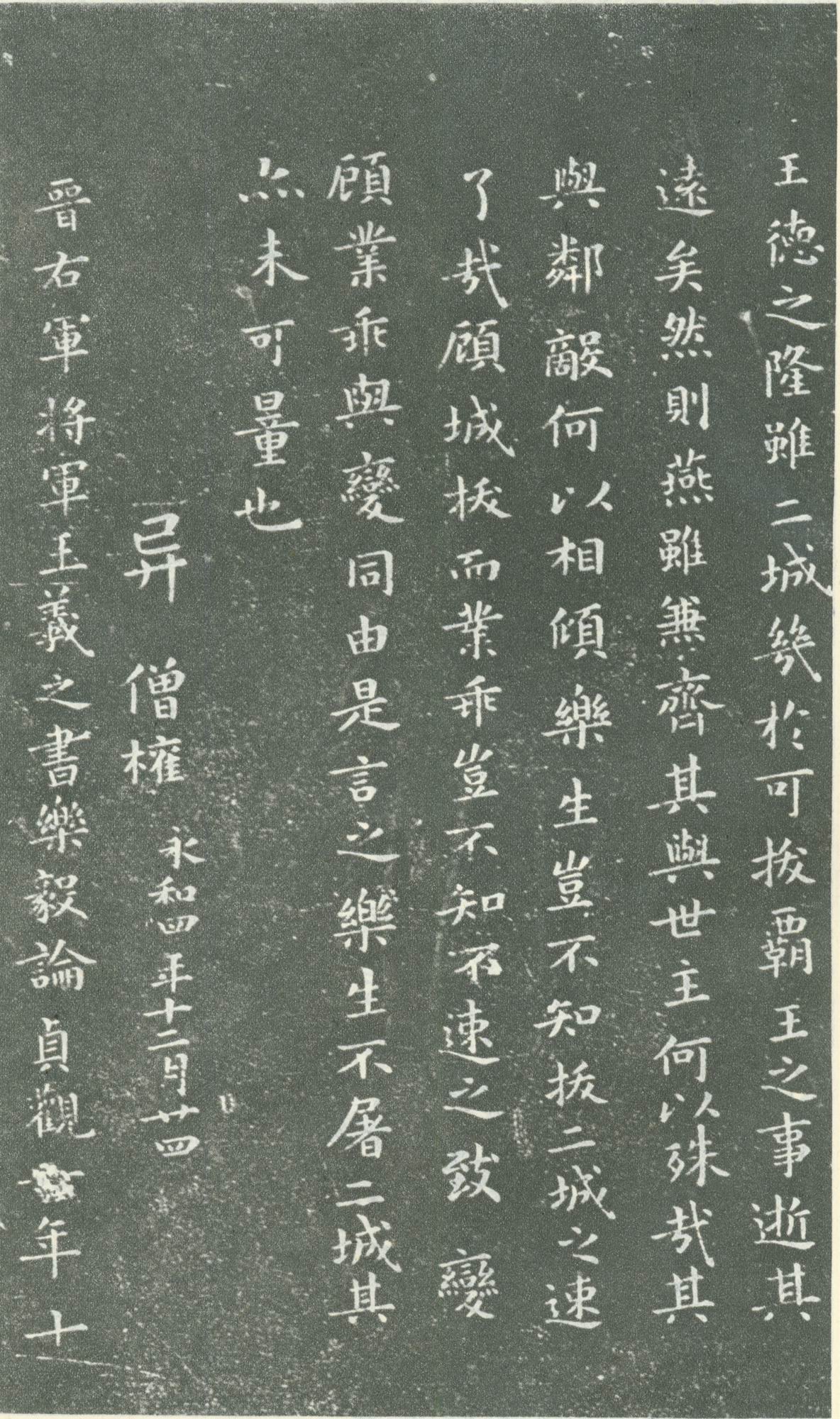
One of Liu's most celebrated work is an essay about a pagoda: The Buddhist Pagoda of Xuan Mi ( 玄秘塔碑 ).
|
|
|
|
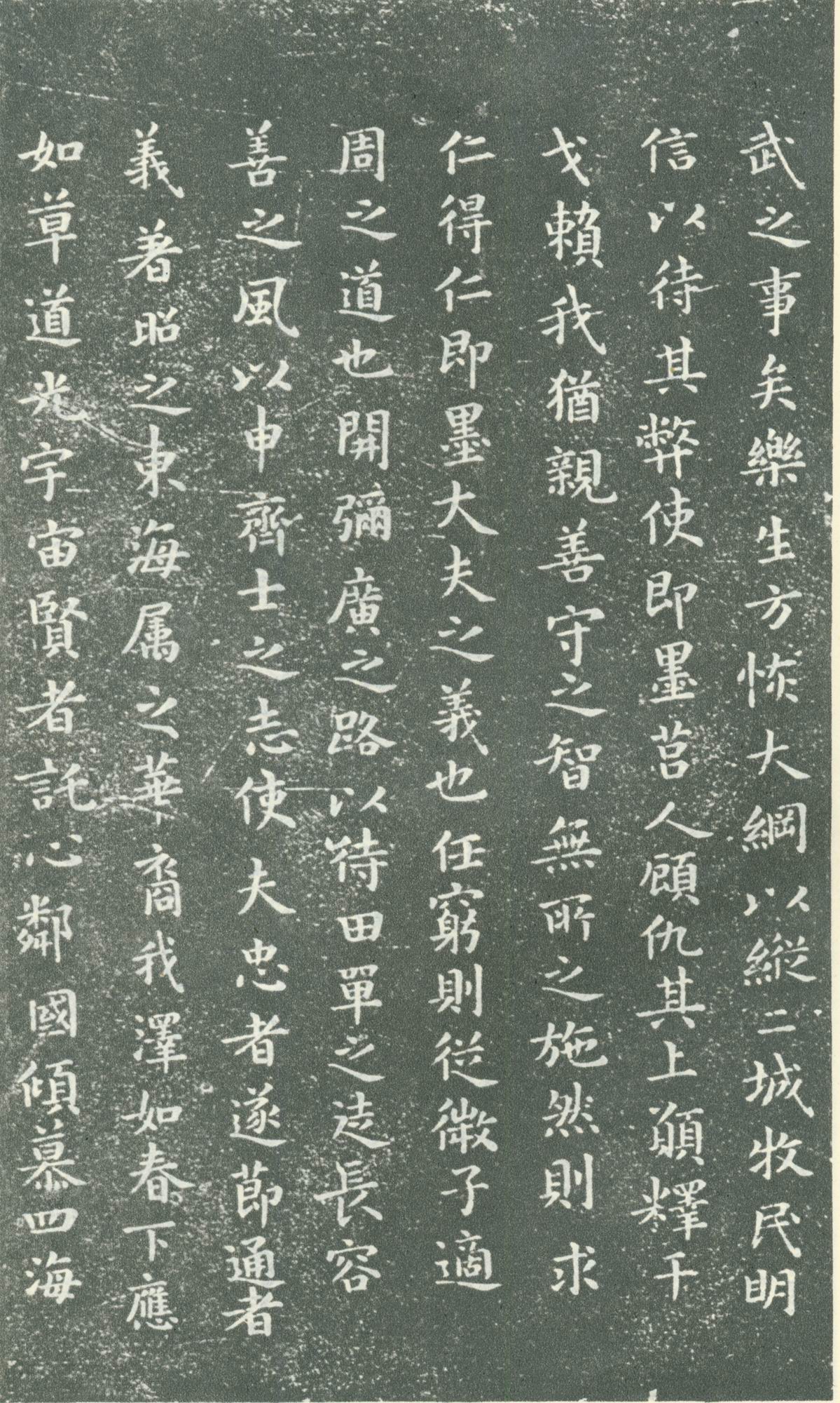
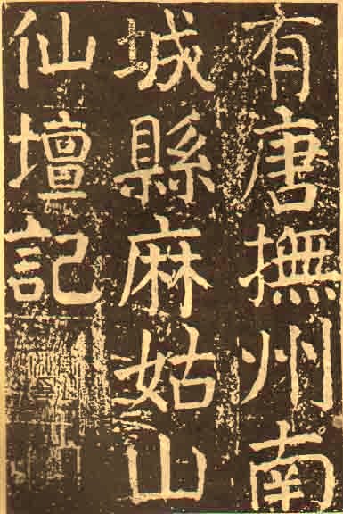
Colophon of Ou-Yang Shuen's Kai Shu Tablet Hwa Du Si Bei |
|
乾隆皇帝酷愛書法,對書法家要求嚴謹規範,獨寵“館閣體”,扼殺了書法藝術的個性,使其趨于退步。然而清朝書法家中,金石書家翁方綱、貌豐骨勁味厚神藏風格的劉墉、書風古樸多姿的成親王、鐵保合稱“翁”、“劉”、“成”、“鐵”四家,與稍後受漢學影響,追蹤漢魏六朝,突破“館閣體”束縛呈現新貌的金農、鄭燮等相應,起承前啟後作用。
|
PLEASE CHECK BACK LATER.
Most
calligraphers agree that Kai Shu is the best choice to start learning Chinese
calligraphy. The reason is that Kai Shu is easier to start and it’s the current
standard style of writing and the current printing fonts used in textbooks,
computers, and public medias. Students may choose a model from the Tang Dynasty
tablets and (or) from Wei Bei tablets for a deeper foundation in techniques and
theories.
If
the student is serious enough and has studied the benefits and theories of Wei
Bei, s/he will realize not to end up in Tang Kai only because
many serious theorists consider Tang Kai as a
“deteriorating form” in structure, nature, and spirit. For a non-native
Chinese, why are those "beautiful" Tang Dynasty Kai Shu works
considered "deteriorating" by serious theorists? There are many aesthetical,
philosophical, and historical issues
to be discussed. Even though Kai Shu
calligraphers in the Tang Dynasty achieved a very high level, we may never reach
their level by practicing Tang Kai only. Almost all the Tang Kai calligraphers
learned or were influenced by the previous dynasties’ work. So cross training
or learning is very important as to broaden one's artistic views.
Guan Ge Ti ( 館閣體 ) refer to a "monotonous" court style of calligraphy used mainly for civil service examinations and government operations in ancient China. It became prevalent in the imperial courts. Guan Ge calligraphy styles have been criticized by many artists and connoisseurs for centuries. Guan Ge Ti does not refer to a certain calligraphic style or a style within the five major styles. To say someone's calligraphy looks like Guan Ge Ti is very demeaning since Guan Ge Ti has negative connotations. There are many discussion forums like www.sf108.com or www.freehead.com where people can post their work and exchange their feedbacks of learning calligraphy. If a work that resembles Guan Ge styles is posted, both the writer and the work will be demeaned since philosophy, artistry, and spirituality are the essential elements of good Chinese calligraphy. On the contrary, Guan Ge Ti is a degenerated style and a tendency to reduce the spiritual and artistic levels of the calligraphy, though it is not necessarily technically easier to create some Guan Ge Ti work with mechanical and monotonous strokes. It is said that a student of Zhong Yao ( 鍾繇 ) wrote something like Guan Ge Ti and Zhong Yao rebuked him so harshly that he dared not see his teacher for three years!
Guan Ge Ti mentioned after 4:38
Samples
of Guan Ge Ti work that are not stone rubbings
Typical Guan Ge Ti calligraphy used in ancient Chinese books, documents or letters
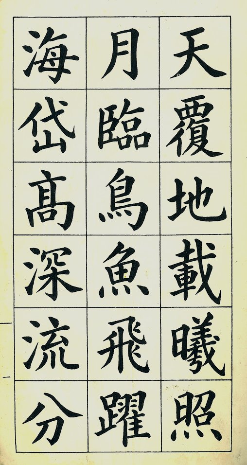
Kai Shu is categorized to Large-scale Kai Shu ( 大楷 ), Medium-scale Kai Shu ( 中楷 ), and Small-scale Kai Shu ( 小楷 ) according to the character sizes. In ancient China, paper was very expensive and it was not easy to obtain paper for writing (even for calligraphers.) People used to write smaller characters more sparingly - thus more seriously and artistically. The original sizes of characters of most tablets, say Oh-Yang Sheun's Kai Shu works, are about the size of a U.S. quarter and most larger characters are about 2" x 2" which are very different from today's perspectives about Large-scale, Medium-scale, and Small-scale Kai Shu.
Today
most people consider that a
Small-scale Kai character is about the
size of a U.S. penny while a Large-scale Kai character is about four to six square
inches or
even bigger.
It’s unanimously accepted that students start from Kai Shu instead of Hsin Shu
and Tsao Shu. And it’s also a rule to start from Large-scale Kai Shu rather than
from Small-scale Kai Shu
because a beginner will be able to focus and do better in bigger strokes than in
tiny and thinner strokes.
After
practicing Large-scale Kai Shu for a while (say, three years), some calligraphers propose to practice
Large-scale Kai Shu and Small-scale Kai Shu every other day (or time) to improve the structure of each character. Thus
we may focus on the main principles while doing Large-scale Kai Shu and improve our detailed
brushwork while doing Small-scale Kai Shu . This is somewhat analogous to sculpture. We cannot make
a statue from details. We have to start from the main structural design and then
work on the details. But if we start from the details, we already carved out the
material and can never reverse it unless we start making a new one.
Oftentimes I am asked by beginners who just started learning the Standard Style "How soon can I start Running or Walking Styles?" Among many high arts of China, such as martial arts, calligraphy, painting, and etc., the beginners as well as the experienced practitioners will go over and over the basics, focus on practicing, and do not anticipate rapid progress intentionally. Masters of these arts have indicated the best and fastest shortcut is anticipating no shortcut. From my personal experience, I practiced Yen Jen-Ching's Kai Shu solely for six or seven years before I moved onto my second style. If I were to be able to quantity my progress with number of years devoted in certain styles and to achieve a certain level, say 85%, the following chart may suggest the readers that patience, persistence, and attitude may be more important than my average natural talents. (To quantify artistic progress without considering mental concentration during practice will be impractical. Suppose I practiced at least 2 or 3 hours per week consistently over the years.)
|
Number of Years I focus on practicing Kai Shu and the basics before proceeding to other styles or Chinese Brush Painting |
Number of Years I start learning other styles such as Hsin Shu or Li Shu, and to achieve 85% |
Number of Years I start learning Zuan Shu and Tsao Shu, and to achieve 85% |
|
| Path 1 |
7 |
2 to 3 |
3 to 5 |
| Path 2 |
5 |
3 to 4 |
5 to 7 |
| Path 3 |
3 |
5 to 7 |
7 to 10 |
| Never Recommended |
1 or less |
7 to 10 |
10 to 20 |
There is a “big picture” in many forms of arts such as music. If we are learning a new music piece and try to memorize and perfect each note and bar before we finish the whole piece, the result will be disastrous as in sculpture with over-detailed beginning. We won’t be able to go back to amend or fix it because it’s already set in structure, phrasing, forms and styles. But if we let learning, analyzing, perfecting, memorizing, improving, and etc. to be practiced step by step, we will probably develop a better measurement to make progress indefinitely. This is also very true in Chinese calligraphy. Remember perfection is relative, not absolute.
After
getting better with Kai Shu, some calligraphers suggest to practice Kai Shu (a.k.a.
真書
Zeng Shu) and Hsin Shu interchangeably (“Zeng Hsin
Hsian Jian 真行相兼”).
In this way, we may strengthen our foundation in Kai Shu to make progress in
Hsin Shu while raising our Kai Shu level and make it look more flowing and
smooth by benefiting from practicing Hsin Shu.
|
歐陽修六一論書 Oh-Yang Shiu's Essays on Calligraphy |
|
自少所喜事多矣。中年以來,或厭而不為,或好之未厭,力有不能而止者。其愈久益深而尤不厭者,書也。至于學字,為于不倦時,往往可以消日。乃知昔賢留意于此,不為無意也。《試筆.學書消日 》 學書勿浪書,事有可記者,他時便為故事。《試筆.學書作故事》 自此已后,只日學草書,雙日學真書。真書兼行,草書兼楷,十年不倦當得名。然虛名已得,而真氣耗矣,萬事莫不皆然。有以寓其意,不知身之為勞也;有以樂其心,不知物之為累也。然則自古無不累心之物,而有為物所樂之心。《試筆.學真草書》
|
Large-scale
Kai Shu ( 大楷
)
– Kai Shu in bigger size.
Medium-scale Kai Shu ( 中楷 ) – Kai Shu in medium size (usually between 1 to 4 square inches).
Small-scale
Kai Shu ( 小楷
)
– Kai Shu in smaller size (about U.S. penny).
Sequence
of strokes (
筆劃順序 ) –
The orders of strokes to write a Chinese character.
Basic
Strokes
– Dian 點,
Heng 橫,
Su 豎,
Go 鉤,
Tee 提,
Pe 撇,
Duan Pe 短撇,
Na 捺.
Tang
Kai ( 唐楷
)
–
Kai Shu in the Tang Dynasty.
Wei
Bei ( 魏碑
) –
Comprehensively refers to Kai Shu tablets in the Wei Dynasty.
 vs.
vs.
 vs.
vs. 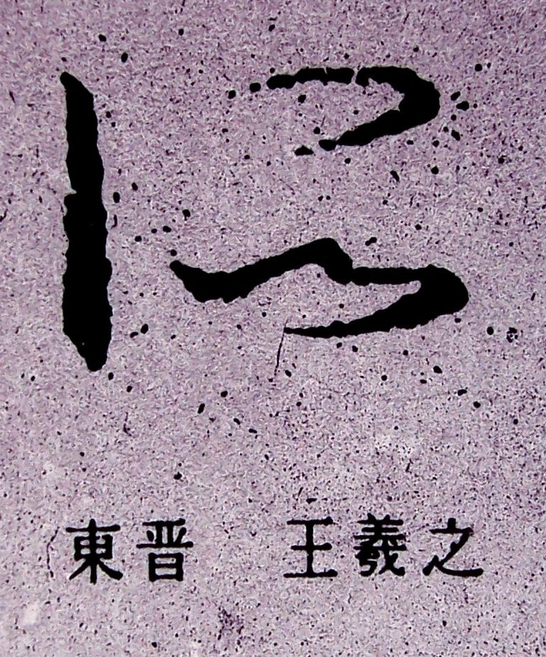
 vs.
vs. .jpg)
 vs.
vs. .jpg)
 vs.
vs. .jpg)
icon.jpg)
icon.jpg)
icon.jpg)
icon.jpg)

.jpg)
.jpg)
%201.jpg)
%202.jpg)
%203.jpg)
%201.jpg)
%202.jpg)
%203.jpg)

.jpg)